

The Golden 60-30-10 Rule: A Guide
- Ishita Shreekant

- Apr 17, 2022
- 5 min read

Are you confused about choosing a colour palette for your room? Not sure about where to start, or how many colours you should pick, or how you should distribute them? Let me tell you about the concept of the 60-30-10 design rule that you can use for choosing a cohesive colour not just for your room, but for an art piece, or graphic design or even cinematography, if that's your forté.
This rule is based on the golden ratio that occurs in nature commonly and was discovered in the 20th Century by mathematicians, artists and architects.


When used in design, the golden ratio fosters organic and natural-looking compositions that are aesthetically pleasing to the eye.
What does the Mona Lisa and The Last Supper by Da Vinci, Starry Night by Van Gogh, the Pyramids of Giza, the logos of Apple, Twitter, Pepsi, etc have in common? Yes, they are all designed using the golden ratio. It is a universally appealing set of proportions that create a balanced aesthetic.
So, how is that related to the 60-30-10 rule and better, how can you use any of that in designing your colour palette? Let me show you.
If you don't wish to read about the concept of the golden ration, feel free to jump right into the guide on how to use the rule in your colour palette.
Let's start with a brief introduction to the Golden Ratio. What is it and how is it that the human brains are seemingly hard-wired to prefer objects and images that use the Golden Ratio? It’s almost a subconscious attraction and even tiny tweaks that make an image truer to the Golden Ratio have a large impact on our brains. The divine ratio exists very commonly in nature, which must explain our subconscious appeal for it.
Divide a line into two parts, divide the longer part (a) by the smaller part (b). The sum should be equal to their sum (a+b) divided by the larger part (a), which should be equal to 1.618, which is the mathematical value of the Golden ratio.
Simply put,

When applying the ratio to shapes, take a square and multiply one side by 1.618 to create a rectangle. You will have a harmonious, balanced, naturally looking rectangle. When you lay the original square onto the rectangle, the two rectangles together will give you the Golden Ratio.
You can keep on dividing the remaining shapes with the help of squares equal to the shorter side of the rectangle.
How to use the golden 60-30-10 rule in your colour palette
The 60-30-10 is nothing but ratios of the various colours in your colour palette that make up a space.
60%
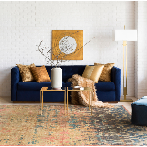
The 60% is your dominant colour. It is the base and backdrop for your furniture, decor, etc.
This colour, of your choosing, can be used for the walls, floors, main furniture elements like couches, or the bed, or coffee tables.
The dominant colour should preferably be a neutral colour, one that enhances the 30% and 10% colours. Neutrals colours include white, cream, beige, light grey, but don't get me wrong, your choices aren't limited to neutrals. Your dominant colour can be dark grey, or olive, navy blue, or other dark colours, or if you're into monochromic palettes, you can have even the boldest of pink shades, to begin with, but if you're a beginner, I would suggest going for light, neutral shades.
Tip: If you plan to have warmer, secondary shades of colour, go for a warmer, neutral colour, like cream or beige, and for a cooler palette, try shades of grey.


30%
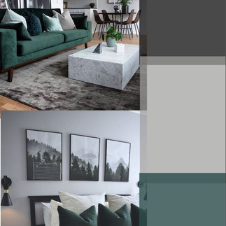
The 30% is the secondary colour, one that can be used to contrast or accentuate your dominant colour. These can be colours on the opposite side of the colour wheel to your dominant colour, or lighter or darker shades of the same. This colour can be used for matching curtains, cabinets, rugs, bed linens or pillows, cushions, or accent chairs. The amount of colour used should roughly be half the amount of your dominant colour.


10%
The 10% is the highlight, the pop of colour in a space. This is the accent colour, so have fun with it.
The accent colour in a space moves the eyes around the room, so it's important to distribute this colour evenly across the room for fluid movement. This highlight can be used for trims and mouldings, or smaller cushions, artwork, throw blankets, ceiling or decor pieces.


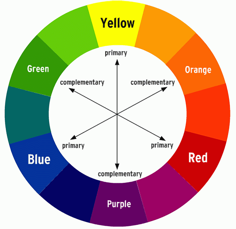
Complementary colours are two hues opposite each other in the colour wheel, like red + green, yellow + purple, blue + orange, whereas Analogous colours are next to each other, like yellow + orange, pink + purple. Monochromatic colours are different tones of the same colour, like grass green + olive green + pastel g


DESIGN TIPS:
BREAK THE RULE LIKE AN ARTIST To break a rule, one must know the rule. This is not a hard and fast guide that has to be followed precisely. It helps in keeping the rule in the back of the mind while picking your colours out, for a more cohesive palette. Why stick with only one accent colour? Break it down into two 5% accent colours, or even go overboard (just a little) and go for the 110%. Experiment with your own ratios if 60-30-10 doesn't work for you. Try working your colours in a 60-20-20, 50-30-20 or any other proportion.


CREATE A FLOW Picking a dominant, secondary or accent colour doesn't necessarily mean you have to match the exact shade. For instance, if your secondary colour is blue, try out different shades of blue for various elements. Like, a Sierra blue vase, a navy blue bed linen, and the like.


MIX & MATCH If you wish to create a cohesive colour theme for your entire house but don't wish to go for the exact same palette in the bedroom as the dining room, for instance, mix up your different colour categories. The secondary colour in your bedroom can act as the accent colour in your dining room. This little trick won't block the flow of colour throughout your house, and you can still experiment with different colour palettes for the different rooms.


OPEN-PLAN HOMES To create a coherent colour palette in open-plan homes, a general principle to follow is to have the same dominant colour for any area that can be seen from the same vantage point. You can experiment with secondary or accent colours in the different spaces, but having different dominant colours will suddenly break the flow of your colour palette.


PATTERNS This colour rule does not restrain you from experimenting with patterns. Pick out patterns in colours matching your colour palette, even if some colours in a particular pattern are out of your colour palette. There should be at least one binding colour in the patterned element, that makes it blend into the colour palette of your room.


MONOCHROMATIC PALETTE Don't fret, this guideline works for monochromatic palettes as well. If you're going for a minimal, clean, white look, try a white + light grey + dark grey palette, or if you're into only one colour, experiment with different shades to create your palette. If in case you're going for only two colours, create a 70-30 proportion.


That pretty much covers the golden 60-30-10 design rule, complete with the technicalities, tips and background information on the golden ratio. I can't wait to see some of your experiments with colour, and how you make or break the rule, like a beginner-pro ;)
Share in your experiences or let me know if I can help out with your process, in the comments.
Until next time,
xx Ishita


Comments